Trials using glyphs to show ML model error rates
It’s long been a goal of ours to work with people who develop ML models. There should be a few different applications of glyphs to the process of developing more accurate models, and with a recent data analytics challenge, we found a way to test a few of them.
The Covid-19 Symptom Data Challenge was focused on using the results of symptom survey data gathered by Carnegie Mellon University and University of Maryland, along with several other data sources each uni had brought together. It was incredibly well run by Catalyst @ Health 2.0, and through their networking efforts we met a group led by Dr. Prahlad Melon.
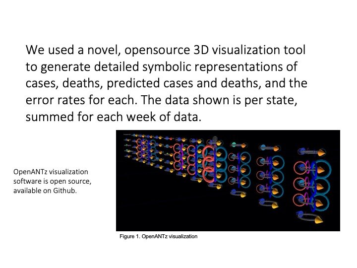
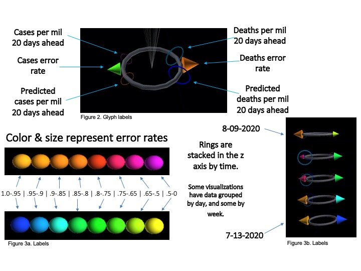
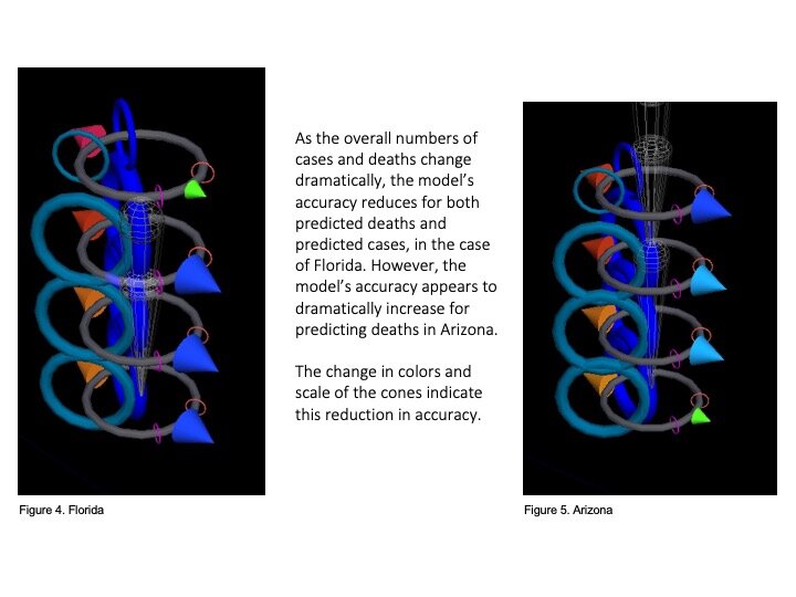
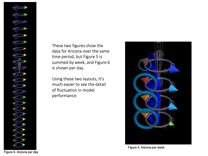
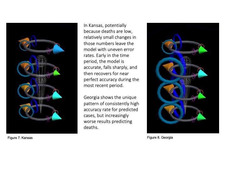
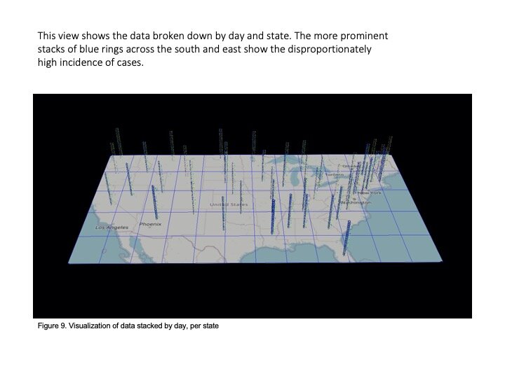
That team (including Prahlad, Jeff Morgan, Rishabh Shetty, and Sage Betko) were incredibly kind in going open kimono and sharing how they were building and testing their models for the challenge. In turn, we built visualizations in OpenANTz using their prediction data. The below slides show visual comparisons of the granular error rates - each day, for each state - between predicted and actual deaths and cases.
We would love to talk to more ML model developers and explore how glyphs might aid you in your work.